Nov 20, 2020
Quick Tips for Improving Color Harmony on Mind Mapping

Nov 20, 2020
Quick Tips for Improving Color Harmony on Mind Mapping

Choose the right color can be hard, but not anymore with the tips today.
Understand color theory, how colors work together, and useful tools helps you to create mind maps like an artist.
In XMind 2020, we’ve got some cool built-in templates that help mind maps to look organized, fit the scene, and make it beautiful. Why not build your own template? It can be stunning and elegant. Most importantly, it fits you. Today, we will be talking about how to make beautiful mind maps with the color harmony.
Let’s start with some basic color theory principles with Sarah, an artist who creates coloring books for stress and anxiety reduction. With these principles, you can have a better understanding of color, and balance your mind map with colors.
Color Wheel
You might have seen this color wheel before.

It is developed by Sir Issac Newton in 1666 and has been used ever since.
There are 12 main colors on the wheel. We were taught about primary colors: red, blue, and yellow.
Combine 2 primary colors, we have our secondary colors: orange, green, and purple.
Those between primary and secondary colors is called the tertiary colors, and they are formed by mixing primary and secondary colors together. For example, red-orange is the tertiary color mixed by red (primary colors) and orange (secondary color). You can find out how it works in this mind map below.

Color Quality
Now, let’s focus on the color of the wheel. There are 4 qualities of each color: Hue, Saturation, Value, and Temperature, and you can find the meanings behind them.

Sarah’s Color Harmonies Tricks
These 4 qualities allow us to know more possibilities of colors. But how do we play with the colors to make a harmonious color symphony?
Sarah tells us that, there are indeed some easy-to-use formulas we can use to create an endless collection of color combination that look balanced. They are known as Color Harmonies, and we’ve gathered them in the mind map below.

You can watch the video for a quick recap.
Colors in XMind 2020
XMind 2020 offers built-in templates, and they are never enough for that. Content of the mind map matters first, and the colors helps to present your ideas better, or in an imaginative way.
Let’s have a look at two classic built-in templates in XMind, and find out the color principles behind it.


- Use 3 or 4 colors on mind maps.
- There are 4 parts need to fill in with colors: Central Topic, Main/Sub Topics, Background, and Others (Relationship, Summary, and Boundary)
- Central Topic the root of the mind map, and it is the spotlight (Grab the attention)
- Make sure the color contrast of background and topics is strong enough, so that the content is easy to read and comprehend.
Let’s Do the Color Harmony Together
Here, we will try 2 ways of color harmony. It’s easy and joyful. Of course, if you’ve mastered the color theory, your mind mapping will be a great work.
Monochromatic Colors
Let’s give it a try with Monochromatic Colors, which is friendly for beginners because it starts with one base color, and develop it with different shade, tone, or tint.
Start with the background color and change it in XMind with different ways.
HSB Sliders
The easy one for beginners :) Drag to adjust the hue, saturation, and brightness and develop colors for the rest part of the mind map.

RGB Sliders
RGB sliders allows you to adjust the ratio of different color and mix the color you want.

There are more to discover for both green hand and novice, simply click the palette in XMind and pick the way you like.
Analogous Colors
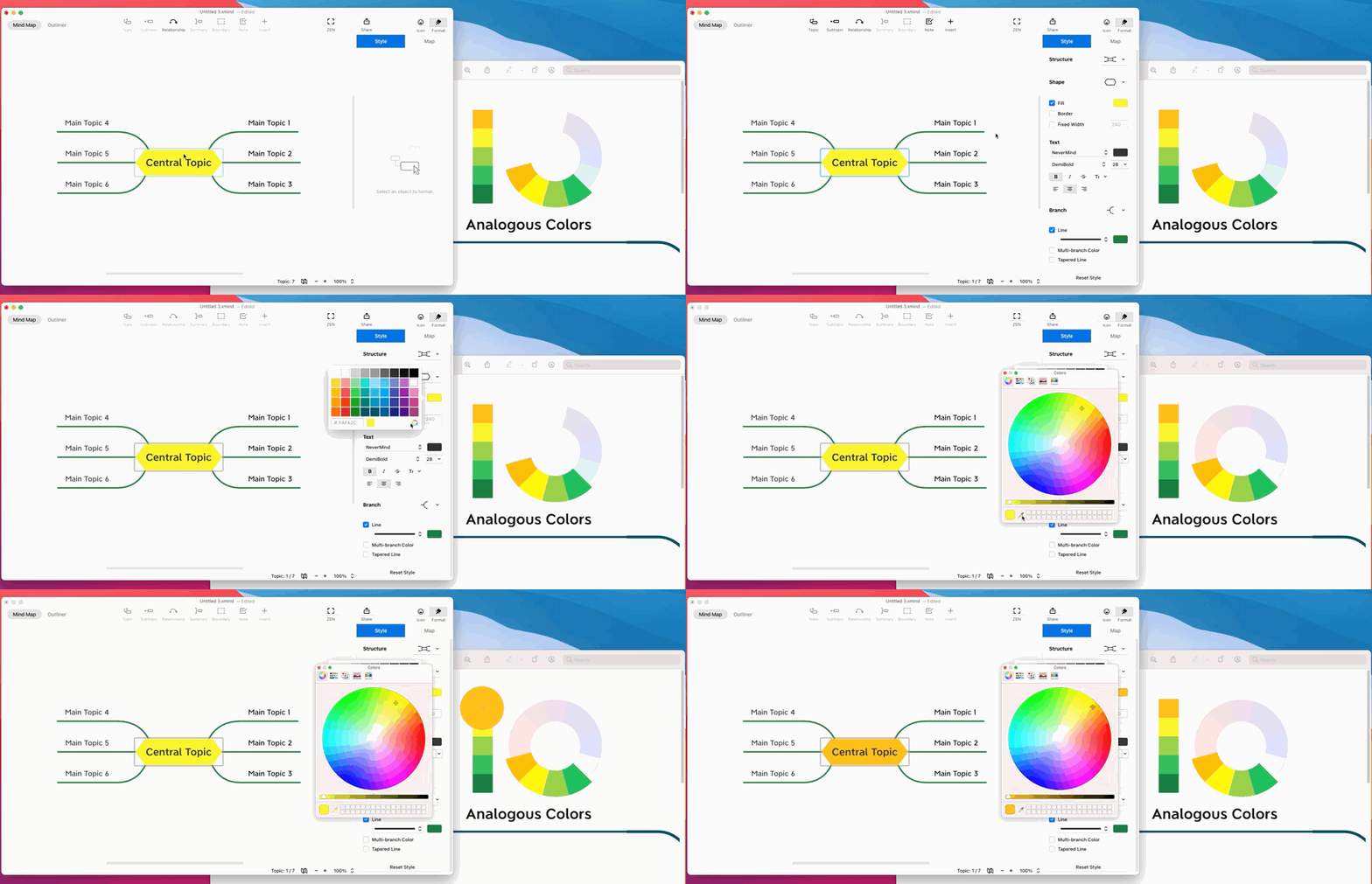
Let’s add up to 2-4 colors. If you have decided the color on the color wheel, you can use color picker to apply it in XMind right away.

Click the Topic, and open the color panel. Then click the palette icon, and click the color picker. This is how it looks:

For branch color, there’s no need to click them one by one, instead, click the Line, and open the color panel for applying them.

Color Palette Options Out There
If you have choice difficulties, you can use color palette already there and combine them directly.
Color Hunt

Color Hunt collects color palette created by the users. The color palettes are used by designers from different industry, artist, illustrators, etc. The palette is a public property and anyone can save their favorite palettes, copy the color codes, and distribute color palettes of their own.
Palettable

In Palettable, all you need to do is clicking Dislike or Like for the current color. With 5 likes, you can gradually build up your very own color palette, thanks to the knowledge of millions of designers.
Color Palettes Collection

It would be better to have the color connected with the mind maps. That’s why color palettes inspired by different topics is helpful. For example, if you are making a recipe mind map, Sarah’s color palettes of beautiful food can be a delight.
Choose the right color is hard? With help of online resources and easy-to-use tool. You can create beautiful mind map easily, both the content and the look.
More Posts
How to Create a Flowchart in XMind (2022) | Tutorial Videos
A compilation of tutorial videos on mind mapping techniques, tricks, and tips. Find in this post how to build a flowchart using shapes and the relationship feature in XMind.

How to Read a Detective Fiction: The Ultimate Guide with XMind
Enjoy reading detective stories with XMind and master these practical tips and tricks for both desktop and mobile.

Create and Organize Recipes With Mind Maps and Tree Table Templates
Using this free tree table template on the newest version of XMind you can create your own recipe, or document your favorite dishes for future tasty journeys in the kitchen!


One space for all your ideas
Organize thoughts, visualize structures, connect ideas, and unlock insights.
Get Started for Free


