Nov 1, 2019
How to Print Mind Map Completely and Clearly
Nov 1, 2019
How to Print Mind Map Completely and Clearly

Presenting the mind map is like giving a second birth of your ideas. Reading the mind map on desktop and printing is different. When printing a mind map filled with topics, characters might be shrunk and it can be hard to read.
Follow the instructions below, and find the right solution when printing.
Fit Page or Actual Size
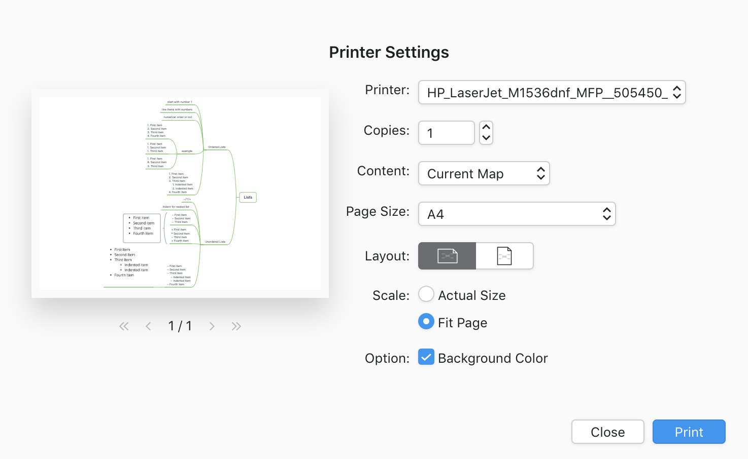
The mind map is bigger when printing, so preview at Printer Settings is important. Actual Size offers an instant view of how your mind map exactly looks on a page size of paper.
his is a comparison of 2 scales of the same map, and the actual size of the map is extremely big for printing. When clicking Fit Page, all the topics can be displayed completely.
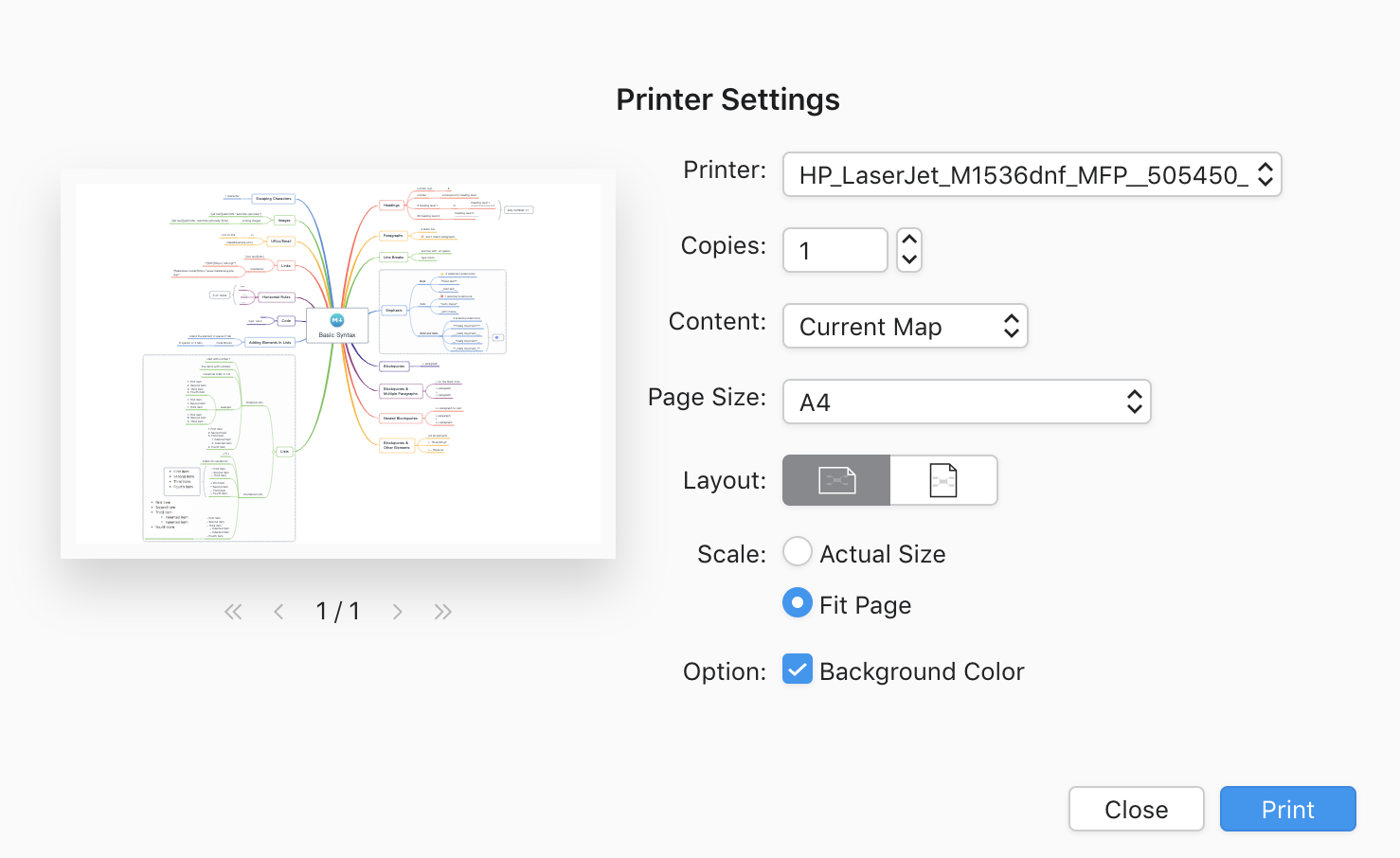
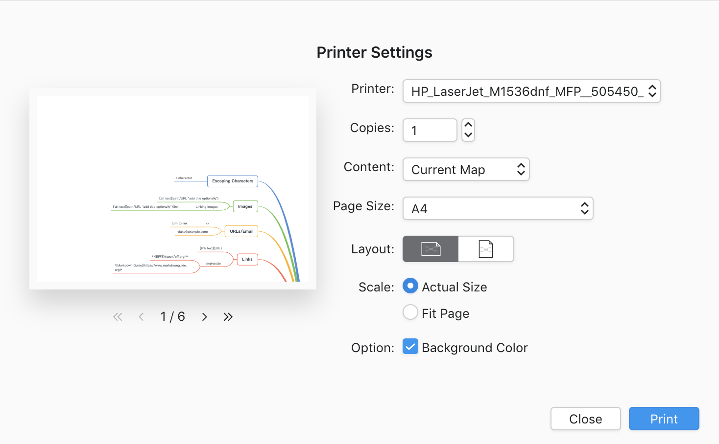
How it works:
Click Print, then select in the Scale
Split Your Mind Map into Several Sheets
Show Branch Only
A load of topics is a reading burden, also for printing.
We edit a map with multiple contents, however, sometimes we might just need to print several topics of it.
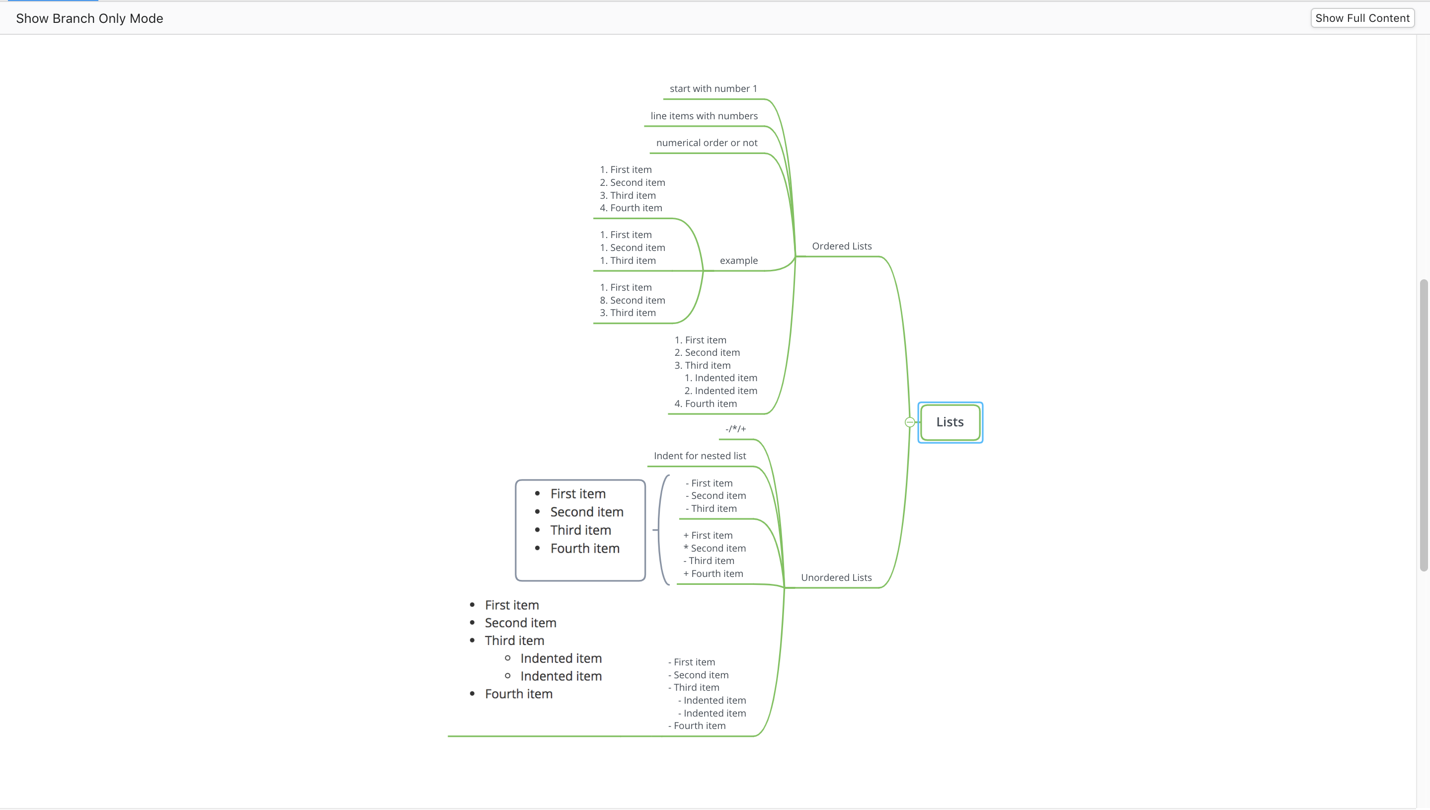
Show Branch Only not only works for visual focus but also works for printing. If one of the topics contains several sub-topics, try to print it separately for a complete view of the information.
How it works:
- Right-click the topics, then Show Branch Only.
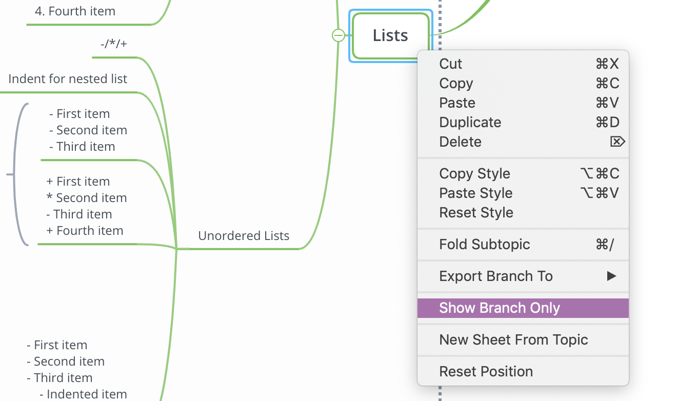
- Read and adjust.
- Click Print, then click the Layout and the Scale to know the printing preview better.
Break the Content Tenderly
Print completely and print clearly are two different topics.
Instead of squeezing all the topics in a can, break down the topics is effective sometimes. If Show Branch Only cannot cover your project, have a try to split topics into different sheets. If you worry about losing topic connections, you can simply use the topic link to re-connect them.
See how Topic Link helps you to connect with your topics here.
Adjust before printing
XMind supports multiple structures for your content, and they are related to the Layout. Fishbone diagrams, balance charts, and matrix diagrams are obvious a couple with a horizontal layout. While tree diagrams and logic diagrams are clearly standing with the vertical layout. Simply change the structure in the Format Panel for the best pursuit of printing.
If balancing the topics is an issue for you, the Auto Balance Map in Advanced Layout of the Format Panel will catch you.
More Posts
How to Create a Flowchart in XMind (2022) | Tutorial Videos
A compilation of tutorial videos on mind mapping techniques, tricks, and tips. Find in this post how to build a flowchart using shapes and the relationship feature in XMind.

How to Read a Detective Fiction: The Ultimate Guide with XMind
Enjoy reading detective stories with XMind and master these practical tips and tricks for both desktop and mobile.
Create and Organize Recipes With Mind Maps and Tree Table Templates
Using this free tree table template on the newest version of XMind you can create your own recipe, or document your favorite dishes for future tasty journeys in the kitchen!


One space for all your ideas
Organize thoughts, visualize structures, connect ideas, and unlock insights.
Get Started for Free


