Feb 15, 2023
Beyond Basic: Innovating Color Use in Mind Maps with Smart Color Theme

Feb 15, 2023
Beyond Basic: Innovating Color Use in Mind Maps with Smart Color Theme

You probably know what a "Color Theme" is - a feature that enables you to apply color schemes to your mind maps, adding visual interest, clarifying ideas, and helping to categorize information. Now introducing the "Smart Color Theme"! It automatically adjusts the color scheme using a more sophisticated and dynamic approach to organize and present your information.
1. The Smart Color Theme story begins...
You also probably think, okay, it's more colorful, more playful, and what else?
Although it is a powerful feature, not all of our users are familiar with it or its potential. Smart Color Theme is the result of over a decade of mind mapping expertise. Competitors do not bother with making mind maps visually appealing and do not invest much effort in niche features because they need to monetize and are under pressure from investors. Even if they do find a pattern, they will not make the process smart and agile as there is a significant amount of hidden effort required from the team to make things appear agile and smart. This blog is all about the Xmind team's thoughtfulness towards the users and the intricacy of the Smart Color Theme functionality. Join us as we explore the world of Xmind's Smart Color Theme and unleash its full potential.
2. What is Smart Color Theme and how smart?
In the good old days, we used to offer a range of "Themes" that consisted of both a Color Theme and a Skeleton design. These predesigned Themes were limited in number and left users with minimal options for customizing their mind maps. However, we have now revolutionized the concept of Themes by breaking them down into separate components.
From: Theme = Color Theme + Skeleton, thus the combinations are immovable.
To: Break the Theme, take Color Theme apart, and become crazy about it!

The Smart Color Theme now operates as a standalone feature that uses algorithms to select the best colors for every detail of your mind map. This provides a more sophisticated and dynamic approach to organizing and presenting your information. Its full potential will be demonstrated in answering a series of common FAQs below.
FAQ 1: How do I choose the right Color Theme for my mind map?
Color Theme: Innovation and Nostalgia:

"Classic" continues the theme colors from the beginning, while "Colorful" is a set of more trendy and youthful color schemes. What is your to-go Color Theme?
FAQ 2: How can I make sure my mind map is readable on a colored background?
- The law of importance: The color intensity is directly proportional from Center Topic to Main Topic, gradually decreasing in intensity. Important and Very Important are the most noticeable.
- Legible text: The text color is automatically calculated to ensure legibility, even when the background color changes, the text adapts to the background color to maintain readability. This was not possible before the use of Smart Color Theme.

FAQ 3: If I like this Color Theme, but not the way the colors are combined?
- No worries.
- Smart Color Theme generates 6 color variations for every Color Theme. It calculates colors that are colorful, monochromatic, dark, light, suitable for printing, and suitable for display. Therefore, there are 32 Color Themes multiplied by 6 Color Variations, which equals 192 Color Schemes!
FAQ 4: Should I use light or dark backgrounds in a mind map?
For the convenience of users, the designer has added a White and a Dark color scheme to multiple palettes. Smart Color Theme will calculate suitable light and dark color schemes for colorful Color Themes.

FAQ 5: Why should I avoid using high saturation colors in a mind map?
- High saturation colors can be visually overwhelming and distracting, making it difficult to focus on the information being presented.
- However, the Smart Color Theme ensures that the automatically generated colors will not have any unpleasant, eye-catching high-saturation tones. All colors will have color harmony and take into account the comfort of the human eye.
FAQ 6: How to and why should use Rainbow “Colored Branch”?
 We recommend using Colored Branch because it enhances creativity and memory stickiness. Colored Branch can also help stimulate the brain and improve retention of information. Studies have shown that the use of color in learning materials can improve memory and recall by up to 50%.
 You will have various different Colored Branch options to suit your preferences. Smart Color Theme ensures that the Colored Branch will complement the Color Theme you have chosen. This feature adds a lot of fun and has a lot of potential to make your information stick.
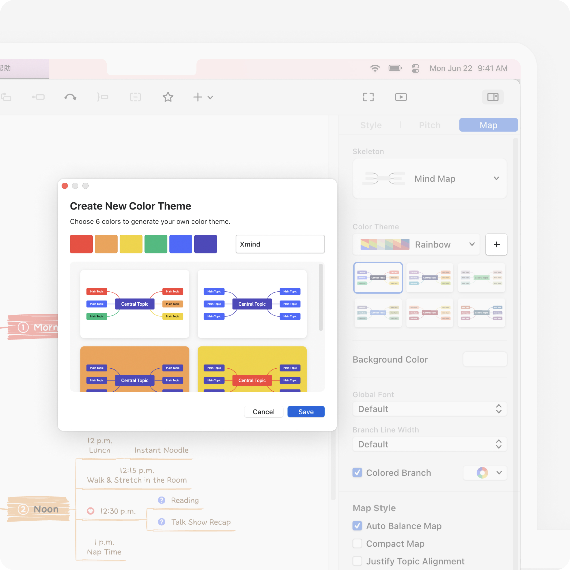
FAQ 7: How to and why should “Create New Color Theme”?

Smart Color Theme like a “Open-source”:
- Hands free!
- We invite you to break the limits and do whatever you want with your color preferences. Smart Color Theme ensures that the Color Themes generated will always look good.
- You can select any six colors to create your Color Theme or choose six colors that represent your brand, team, or project. Smart Color Theme will create six visually pleasing color variations that are suitable for mind maps.


- The demonstrations are Post-it@📒, Pizza🍕, Olympic Game🏅️, LA Lakers Basketball🏀, and the movie Howl’s Moving Castle🏯.
3. Smart Color Theme in practical uses
Business Identity.
Create New Color Theme that represents your brand identity.
Having a consistent color scheme is important for building brand recognition, creating a professional image, evoking emotions, promoting team spirit, and setting your brand apart. It helps establish a visual identity and builds a sense of unity and shared purpose within an organization, making it easier for your brand to be recognized and remembered by your audience.
e.g.: “Pizza Color Theme” for pizza restaurant staff lists

e.g.: “LA Laker Color Theme” for basketball practice plan

Marketing Material
Use Color Theme that speaks for your product categories
The use of color in marketing materials can be a powerful tool for attracting attention, conveying key messages, and creating a consistent brand image. Here's how color themes can work in marketing materials:
e.g.: "Quaint Color Theme" can evoke emotions of calm and refresh.

Study material
Create a new color theme that promotes focus and concentration.
Incorporating a strong color scheme in study materials is important for improving retention, engagement, clarity, and differentiation. Color can help organize information, make it memorable, and keep students engaged, leading to better learning outcomes and a more enjoyable study experience. For example, when 3M company began testing their product, they found that the bright yellow color was the most eye-catching and noticeable. They subsequently settled on that color for their standard note.
e.g.: ”Post-it Yellow Color Theme“ for study notes

Life and entertainment
Let Color Themes enhance your mood and elevate your everyday experiences
Incorporating a calming color theme into your family travel plans can make them more organized and memorable. It helps keep track of important information and creates excitement. Colors can be associated with specific experiences, making the trip more memorable and emotionally connected. A color-themed plan can lead to a more enjoyable experience for everyone involved.
e.g.: “Sakura Color Theme” for Tokyo’s cherry blossom trip

In addition to mind maps, there are many other things that can be made more fun and visually appealing by incorporating color, such as recipes, menus, home decor plans, gift lists, and more. By using Smart Color Theme, you can be sure that all of your color choices will be visually appealing and harmonious, no matter what you're creating.
Lastly, from all the staff members in the Smart Color Theme project:
“Smart Color Theme was a unique project that required significant effort, as it was not considered as important as other factors by some users. Despite this, we at Xmind continued to push boundaries, using algorithms to explore all possible color pairings and move beyond traditional combinations. Our mission is to keep evolving and rethinking what's possible.
Most mind mapping software cares more about maintaining a consistent color scheme for clarity than creating a visually engaging and playful mind map with lots of colors. However, at Xmind, we believe in infusing creativity into the thinking process and final presentation. We relish the upgrades to our features and hope that adding a dash of color to your work can bring it to life, help you overcome obstacles, and create something meaningful. "
Be bold and infuse your thinking process and mind maps with more color and playfulness!
More Posts
Flowchart Essentials: Definition, Templates, and Free Softwares
Discover the power of flowcharts with our detailed guide. Learn what a flowchart is, explore practical use cases, and discover how to create and optimize them using softwares like Xmind and Xmind AI for enhanced workflow efficiency.

Bubble Maps: Definition, Examples, and How to Create in Xmind
Discover the power of bubble maps for data visualization with our comprehensive guide. Learn about different types, practical applications, and best mind mapping tools like Xmind. Get step-by-step instructions and expert tips to create stunning bubble maps for brainstorming, project management, and report writing.

The Complete Guide to Organizational Chart [2024]
Discover the simple steps to build dynamic organizational charts with Xmind.


One space for all your ideas
Organize thoughts, visualize structures, connect ideas, and unlock insights.
Get Started for Free


