Xmind (Beta) Updates: Maximize Your Strategic Planning with the Grid Structure
Mar 4, 2024

Xmind (Beta) Updates: Maximize Your Strategic Planning with the Grid Structure
Mar 4, 2024
Hey there, thinkers, planners, and dreamers! Have you ever felt like your brain is a popcorn machine full of ideas, waiting to burst into the perfect formation? Keep your kernels close because the latest Xmind (Beta) are here to transform those pops of genius into a masterfully organized visual feast with their all-new Grid Structure!
Quickly Learn Grid
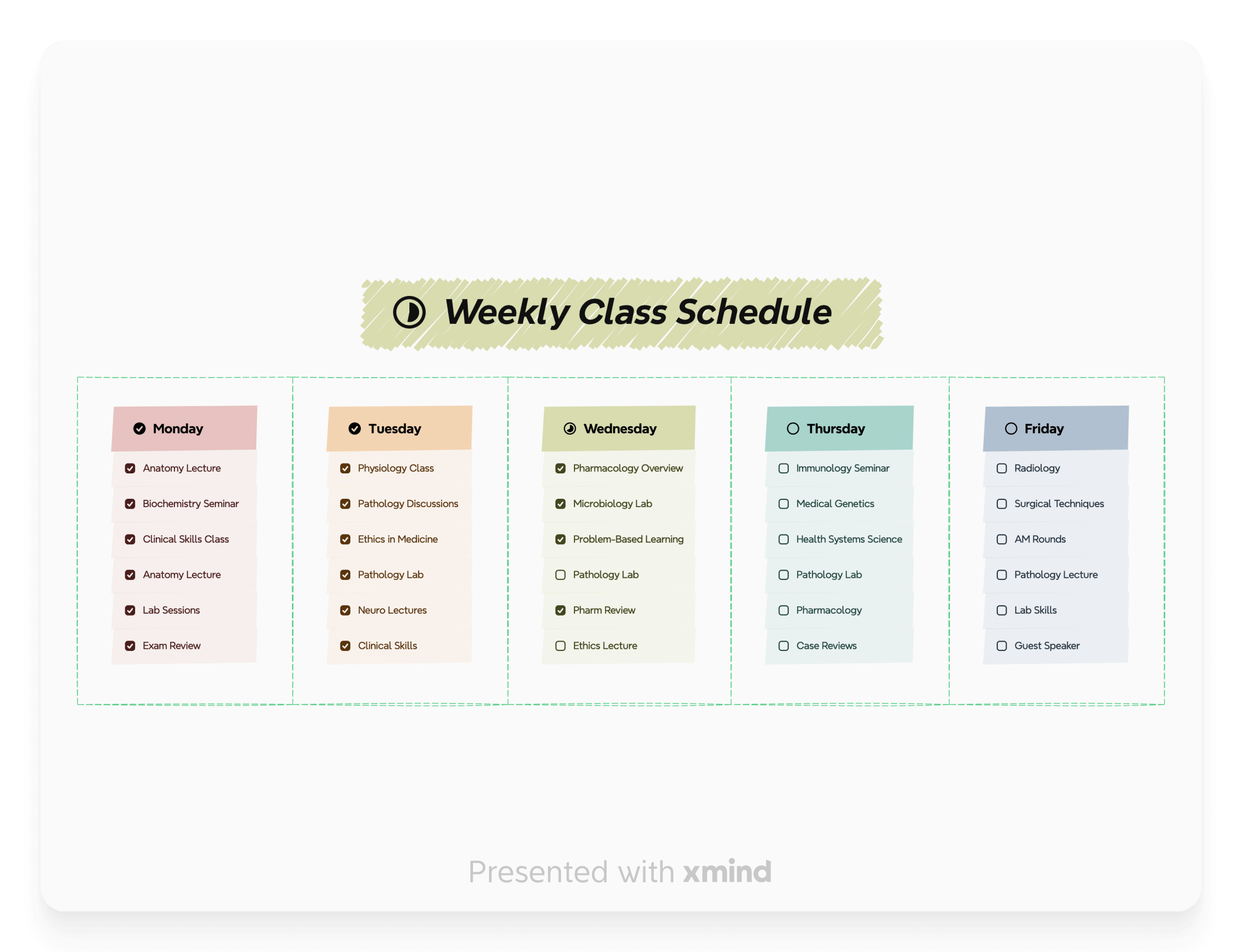
The Grid Structure, a table-shape chart structure, is a vital update in the latest Xmind (Beta), helping users to segment and organize their thoughts with precision and clarity. It is a flexible format that is particularly effective for strategic planning but can be adapted to various needs such as project management, personal goal setting, and creative brainstorming.
When you use the Grid Structure, you divide your space into multiple identifiable sections, making it easier to manage complexity and anticipate potential intersections or dependencies between various elements of your plan.

Tutorials and Tips
Previously, creating table charts like this required a labor-intensive process involving multiple meticulous steps. You had to generate Floating Topics, position them with precision, and then carefully draw Boundaries around each to signify cell borders. This task demanded a considerable amount of time and attention to detail, ensuring alignment and proper organization. Fortunately, the Grid Structure has simplified all of these.
One-click to Create
Open Xmind (Beta) and select the Central Topic, go to the Format panel and click Style, and you can create a Grid chart with one click.

Customize Your Grid Chart
Decide how many Columns you may need at the very beginning. Elevate your chart's impact by customizing it through a selection of distinctive Shape, Border, and Branch designs to distinguish each hierarchical level of topics. Inject your own style by experimenting with a mix of colors, textures, and line styles to create a visual hierarchy that makes your data not only informative but also visually engaging. Here's how you might start: 👇

Multiple Structures in One Chart
If the uniformity of a single-structured chart seems lackluster, consider breathing new life into your data presentation by introducing diversified structures for various topic levels. Begin by selecting the Topic of interest, then proceed to Style in the Format panel. There, click on Structure to unveil a curated selection of layouts that cater to diverse preferences and specific needs. This customization can transform your chart into a more dynamic and visually engaging tool, better suited to convey the intricacies of your information.

Grid-ify Your Ideas
Now that you've mastered the Grid Structure, it's an opportune moment to weave this versatile framework seamlessly into every facet of your daily routine. Elevate your experiences by allowing the Grid Structure to bring a new dimension of efficiency and clarity to your projects, time management, and even your thought processes. Embrace this tool to unlock a higher plane of productivity and balance, propelling your life's endeavors to unprecedented heights. Let's explore how this can be a transformative element for you!
Maximize Strategic Planning in Study and Work
Continuously Improve Yourself
Add More Entertainment to Life

 Try Xmind Free