Apr 2, 2025
15 PowerPoint Presentation Ideas to Fix Boring Slides in 2025
Apr 2, 2025
15 PowerPoint Presentation Ideas to Fix Boring Slides in 2025

Did you know that 46% of people can't sit through a presentation without losing focus? That's nearly half your audience potentially zoning out during your slides.
However, this isn't surprising when most PowerPoint presentations still follow the same tired formats from a decade ago. The stakes are high - 70% of employees consider giving good presentations an essential workplace skill.
That's why we've compiled 15 powerful PowerPoint presentation ideas to transform your boring slides into engaging masterpieces. Start by trying Xmind to organize your presentation structure and create impactful slides that keep your audience hooked from start to finish.
Use Mind Mapping to Organize Your Presentation
Mind mapping stands as one of the most effective ways to break free from presentation mediocrity. Research shows that 65% of people learn visually, making mind maps the perfect tool for organizing complex information into easy-to-understand visual formats.
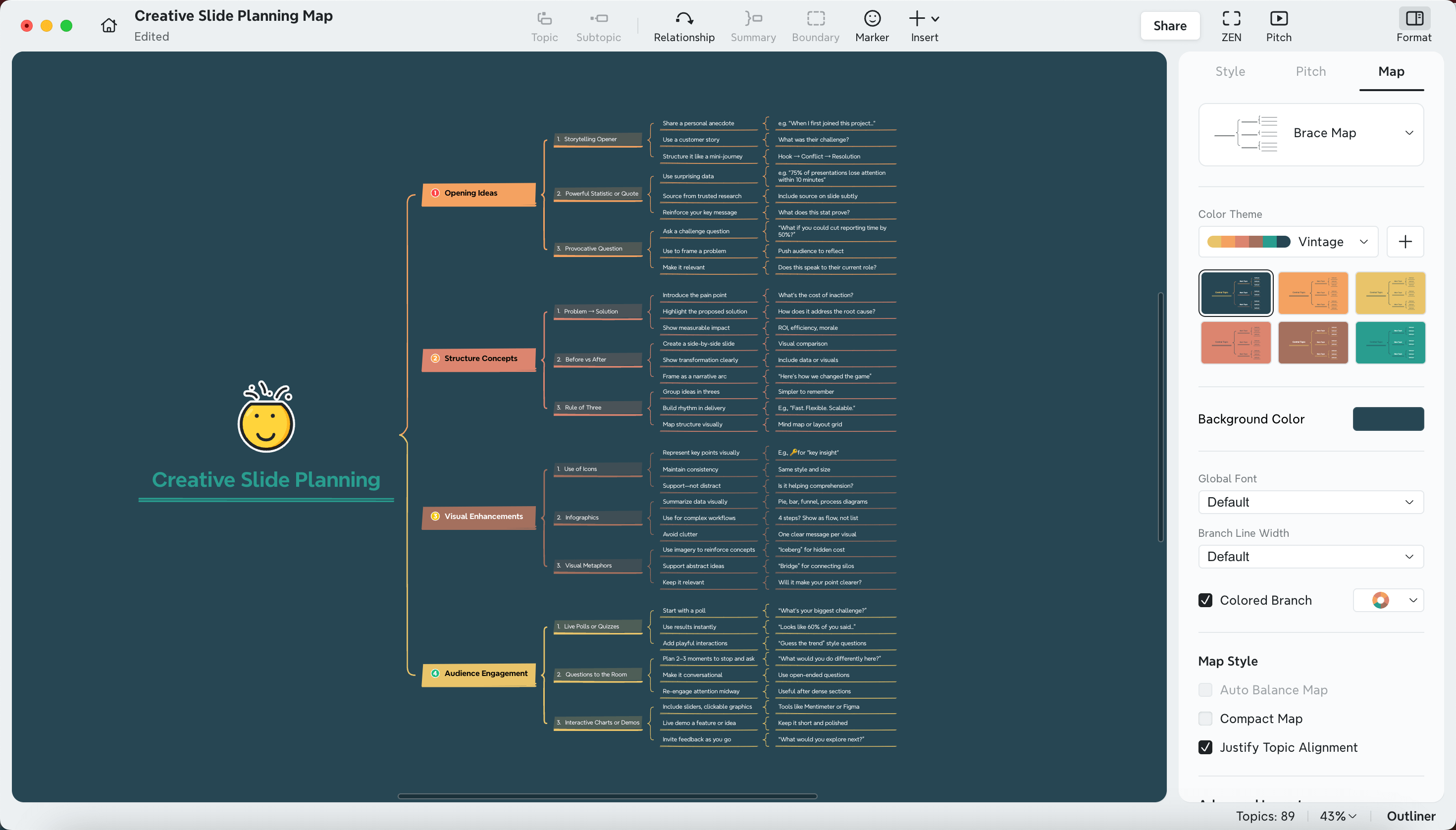
How Xmind Transforms Presentation Planning
Xmind revolutionizes how you approach presentation creation by offering a balance between effort and effect. Unlike traditional presentation software that requires manual alignment of elements, Xmind automatically generates layouts, saving you considerable time. The platform provides abundant skeletons and over 100 preset templates that help you brainstorm ideas without starting from scratch. Furthermore, these templates are freely available and require no account registration.
Creating a Visual Hierarchy with Mind Maps
Mind maps structure information in a hierarchy that starts with a central idea and branches out into related subtopics. This visual layout matches your brain's natural way of making connections. In fact, 92% of people report that mind mapping improves their thinking and planning abilities. Xmind's user-friendly design allows you to:
Start with your central message as the focal point
Branch out to main points and supporting details
Use colors to categorize different elements
Add visual elements to enhance understanding
Converting Mind Maps Directly to PowerPoint Slides
Transforming your mind map into presentation slides is remarkably straightforward with Xmind. With just one click, you can export your entire mind map into fully editable PowerPoint slides. Additionally, Xmind's Pitch Mode transforms your mind map into a polished presentation without additional design work. The system automatically generates beautiful slides based on your mind map structure, delivering content with elegant layouts and in-page animations.
Case Study: Before and After Xmind Planning
Consider a typical presentation process: hours spent arranging slides, struggling with visual hierarchy, and ending with disconnected content. In contrast, using Xmind first creates a dramatic difference. A presentation that previously took 3 hours to structure can be organized in under 30 minutes. The auto-generated layout eliminates alignment struggles, consequently ensuring your audience grasps the relationships between ideas.
Ready to transform your presentation planning process? Try Xmind today and experience how mind mapping can elevate your PowerPoint presentations from boring to brilliant.
Implement a Consistent Visual Theme
A striking visual theme is the backbone of effective PowerPoint presentations. Visual consistency helps audiences understand your content more easily while building credibility with a professional, unified appearance.
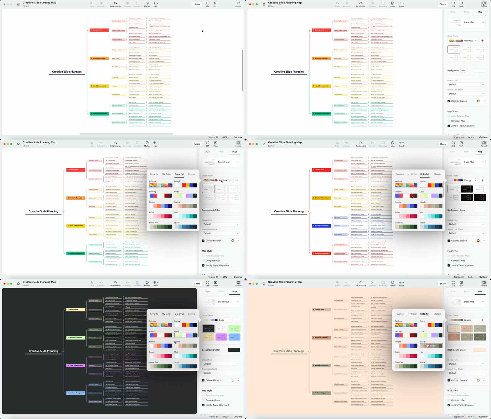
Choosing Color Schemes That Pop
The right color palette can make or break your presentation design. For projected presentations, lighter backgrounds enhance readability, whereas darker schemes often look better on computer screens. When selecting your palette:
Use a primary color that reflects your presentation's tone with 1-2 complementary secondary colors
Consider color psychology—blue conveys trust, orange stimulates creativity
Ensure high contrast between text and background for readability
Black backgrounds with thin, light-colored text (50% gray, brightened until legible) work excellently for darkened rooms. Moreover, navy blue with yellow accents creates an executive yet lively presentation, while black and gold combinations deliver high-end, luxurious vibes.
Typography Best Practices for 2025
Consistent font application projects professionalism and enhances understanding. For maximum impact:
Limit yourself to 1-2 font families throughout your presentation
Choose sans-serif fonts like Arial, Helvetica, or Calibri for digital presentations
Select serif fonts like Times New Roman for formal printed handouts
Maintain font hierarchy by establishing consistent sizes—larger for headings, medium for subheadings, and smaller for body text. Additionally, follow accessibility guidelines by preserving a minimum contrast ratio of 4.5:1 for standard text and avoiding overly decorative fonts.
Creating Custom Templates That Stand Out
Custom templates save time and ensure consistency across all slides. To create one:
Start with a slide master and modify layouts (View > Slide Master)
Apply your chosen theme, fonts, and color scheme
Create consistent placeholder positions for text and images
Save as a PowerPoint Template (.potx) file
PowerPoint automatically stores templates in the Custom Office Templates folder, making them easily accessible for future presentations. Primarily, well-designed templates contain attractive layouts, distinctive background styles, and unique color combinations.
Leverage Xmind's Pitch Mode for Dynamic Delivery
Beyond just creating slides, the way you deliver them can make or break your presentation. Xmind's Pitch Mode offers a refreshing alternative to traditional slideshow delivery, turning static mind maps into dynamic visual experiences that captivate audiences.
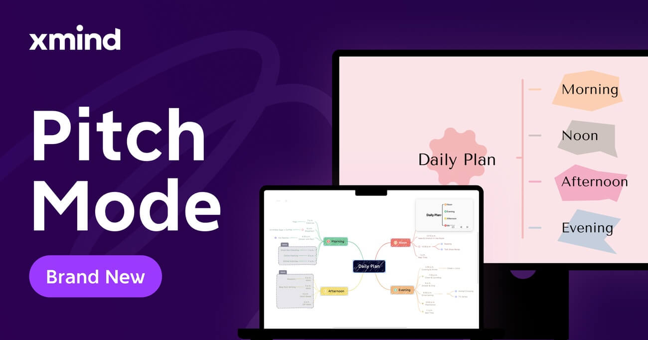
Setting Up Pitch Mode in Xmind
Activating Xmind's Pitch Mode (their presentation feature) is straightforward. Simply click the Play icon in the upper right corner of your workspace to instantly transform your mind map into a full-screen presentation. Xmind offers five decorative theme layouts, each with distinct visual and dynamic effects, allowing you to create presentations that stand out from typical PowerPoint slides.
Pitch Mode provides both black-and-white themes and colorful options to match your presentation style. The system automatically converts your static mind map into a wonderful dynamic display with a single click, eliminating the need for separate presentation software.
Creating Zoom Animations Between Topics
Xmind's zoom capabilities add powerful visual emphasis to your presentations. You can:
Zoom in or out by adjusting the percentage at the bottom right corner
Use keyboard shortcuts for quick adjustments (Windows: Ctrl+Scroll Up/Down, Mac: ⌘+Scroll Up/Down)
Focus on specific topics by selecting them before zooming
Create zoom animations between topics for smooth transitions
Primarily, Xmind's system zooms in/out centered on your selected topic box or defaults to the central topic if none is selected. This feature allows you to highlight important information while maintaining context, especially useful for complex mind maps.
Using Xmind for Non-Linear Presentations
Traditional presentations follow a linear path. Conversely, Xmind's Presenter View revolutionizes this approach:
Navigate freely through your content by clicking directly on branches
Jump immediately to important topics without sequential constraints
Maintain a bird's-eye view of your entire presentation structure
Flexibly adjust your presentation flow based on audience interests or time constraints
Hence, you can control the slideshow using mouse or keyboard operations—switching to previous or next slides, skipping topics, or returning to list slides with fast forward and rewind support.
Ready to transform your presentation delivery? Try Xmind today and discover how dynamic navigation can elevate your next presentation beyond static PowerPoint slides.
Replace Text-Heavy Slides with Infographics
Visual information is processed 60,000 times faster than text by the human brain, making infographics a powerful alternative to text-heavy slides. After organizing your ideas with Xmind, the next step is transforming that content into visually appealing infographics that capture and maintain audience attention.
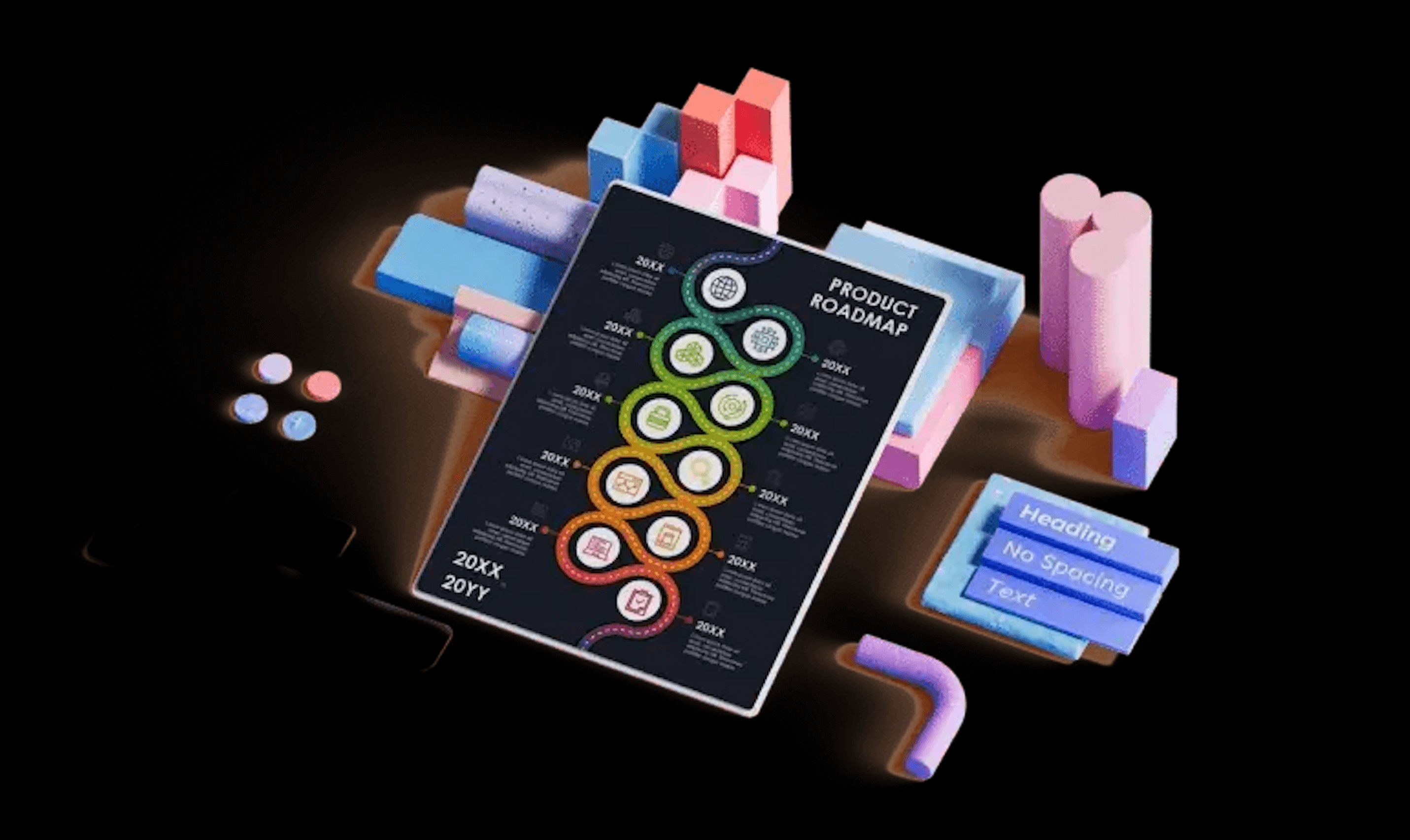
Types of Infographics That Engage Audiences
Several types of infographics work exceptionally well in presentations:
Process infographics visualize steps in a workflow, making complex procedures easier to follow
Statistical infographics bring numbers to life through charts and visual elements
Timeline infographics organize events chronologically, perfect for presenting history or project roadmaps
Comparison infographics effectively showcase differences between options or products
Geographic infographics visualize location-based data through maps and heat maps
Notably, according to research, 65% of people are visual learners, making infographics an ideal medium for conveying complex information.
Tools for Creating Professional Infographics
Creating stunning infographics doesn't require advanced design skills. These tools make the process straightforward:
Canva offers extensive templates and thousands of illustrations with customizable colors and various chart styles. Its drag-and-drop interface makes creating infographics intuitive even for beginners.
PowerPoint itself has powerful infographic capabilities. You can customize your own infographics right inside your PowerPoint decks using built-in tools and templates.
Venngage specializes in various infographic types including statistical, informational, process, and comparison templates.
Xmind's Pitch Mode seamlessly converts your mind maps into visually appealing slides, essentially creating infographic-style presentations with minimal effort.
Data Visualization Best Practices
To create effective infographics that truly communicate:
Maintain simplicity - Avoid cluttering slides with excessive data or unnecessary graphical elements.
Use strategic color - Select colors that complement each other and ensure readability. Limit your palette to prevent visual overwhelm.
Incorporate interactivity - Add clickable elements like hyperlinks or buttons to allow audiences to explore data at their own pace.
Provide clear annotations - Use text boxes, callouts, and arrows to highlight key insights and guide understanding.
Establish visual consistency - Maintain the same color palette, font style, and layout throughout your presentation.
For maximum impact, try converting your Xmind mind maps directly to presentation slides, preserving your information hierarchy while transforming text-heavy content into engaging visual stories.
Add Interactive Elements to Your Slides
Transform passive viewers into active participants by adding interactive elements to your PowerPoint slides. After organizing your ideas with Xmind and creating a visual theme, interactivity is your next powerful tool for audience engagement. Xmind allows you to inset clickable elelments like web page links, attachments, local images and more.
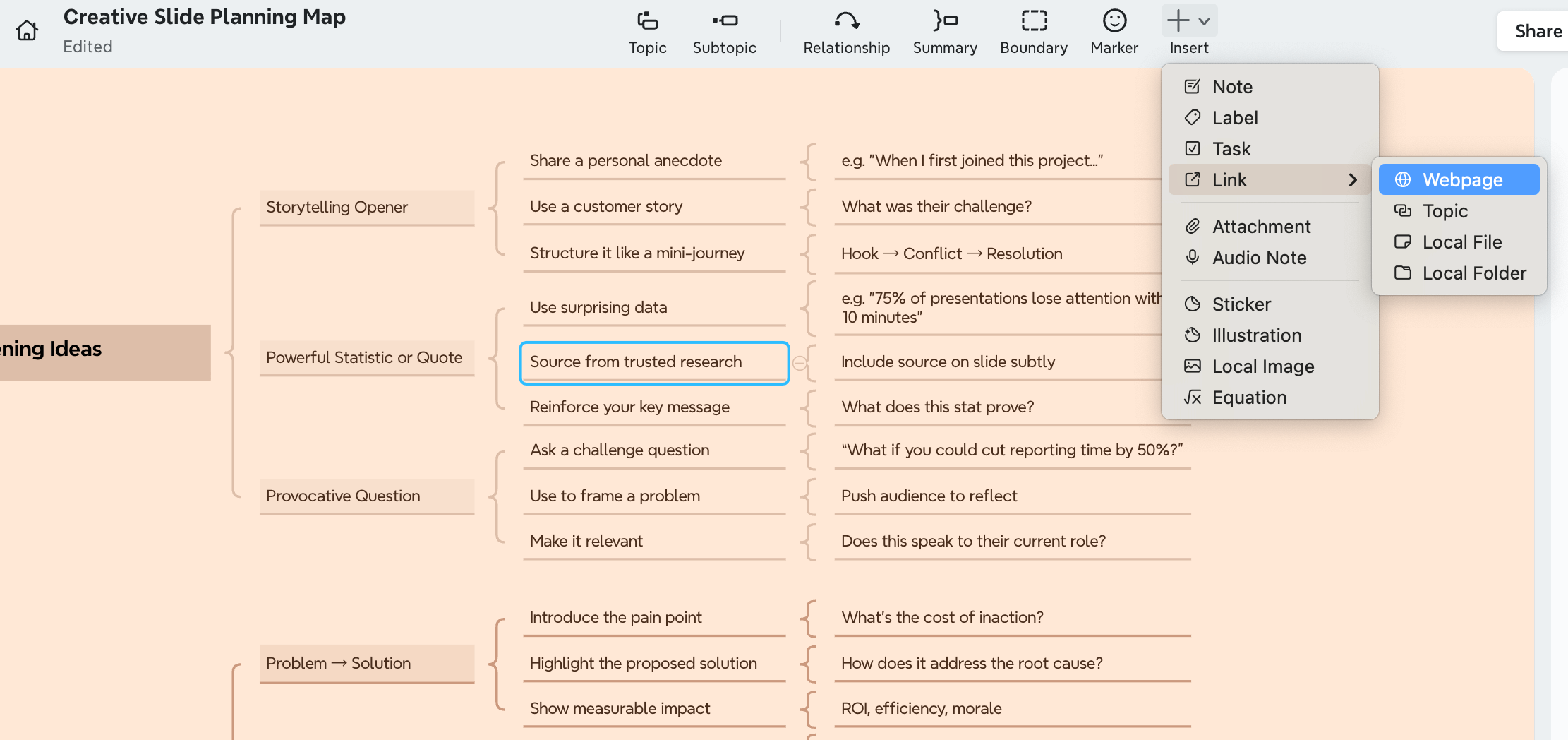
Clickable Elements That Enhance Navigation
PowerPoint's action buttons and triggers create seamless navigation experiences:
Hyperlinked menus: Create a central menu slide with clickable buttons linking to different sections. This gives audiences control over their journey through your content, allowing them to focus on what matters most to them.
Action buttons: Insert navigation elements (Home, Next, Previous) by selecting Insert > Shapes > Action Buttons. These shapes automatically link to destinations when clicked during your presentation.
Custom triggers: Set up on-click interactions that reveal hidden content or activate animations. Select your animation, then click Trigger > On Click of > (select your button) to create popup menus and interactive elements.
For best results, add a home button on every slide to enable quick returns to your menu, creating a truly non-linear presentation experience.
Embedded Polls and Surveys
Real-time audience feedback transforms one-way presentations into interactive conversations:
Slido integrates directly with PowerPoint, allowing you to create polls, quizzes, and word clouds that automatically activate as you present. Participants simply scan a QR code to join instantly—no downloads or logins required.
Alternatively, Poll Everywhere enables live audience engagement through multiple activity types, from one-click answer options to open-ended responses. Responses update in real-time as audiences submit answers via their devices.
Interactive Charts and Graphs
Bring your data to life with charts that audiences can explore:
PowerPoint now supports embedding web applications directly in presentation sheets. This means you can include fully interactive charts that remain functional even during presentations.
To add interactive charts:
Navigate to Insert > My Add-ins > Web Viewer
Input the URL of your chosen chart (remove "https://")
Click "Preview" to see your chart in action
Want to take your interactive presentations to the next level? Try Xmind to organize your ideas before adding these engaging elements.
Incorporate Short Video Clips
Short video clips added to your PowerPoint presentations can increase audience engagement by 80%. Rather than overloading slides with text, strategically placed videos create dynamic pauses that recapture attention and explain complex concepts more effectively. Doing this by inserting a video attachment in Xmind.
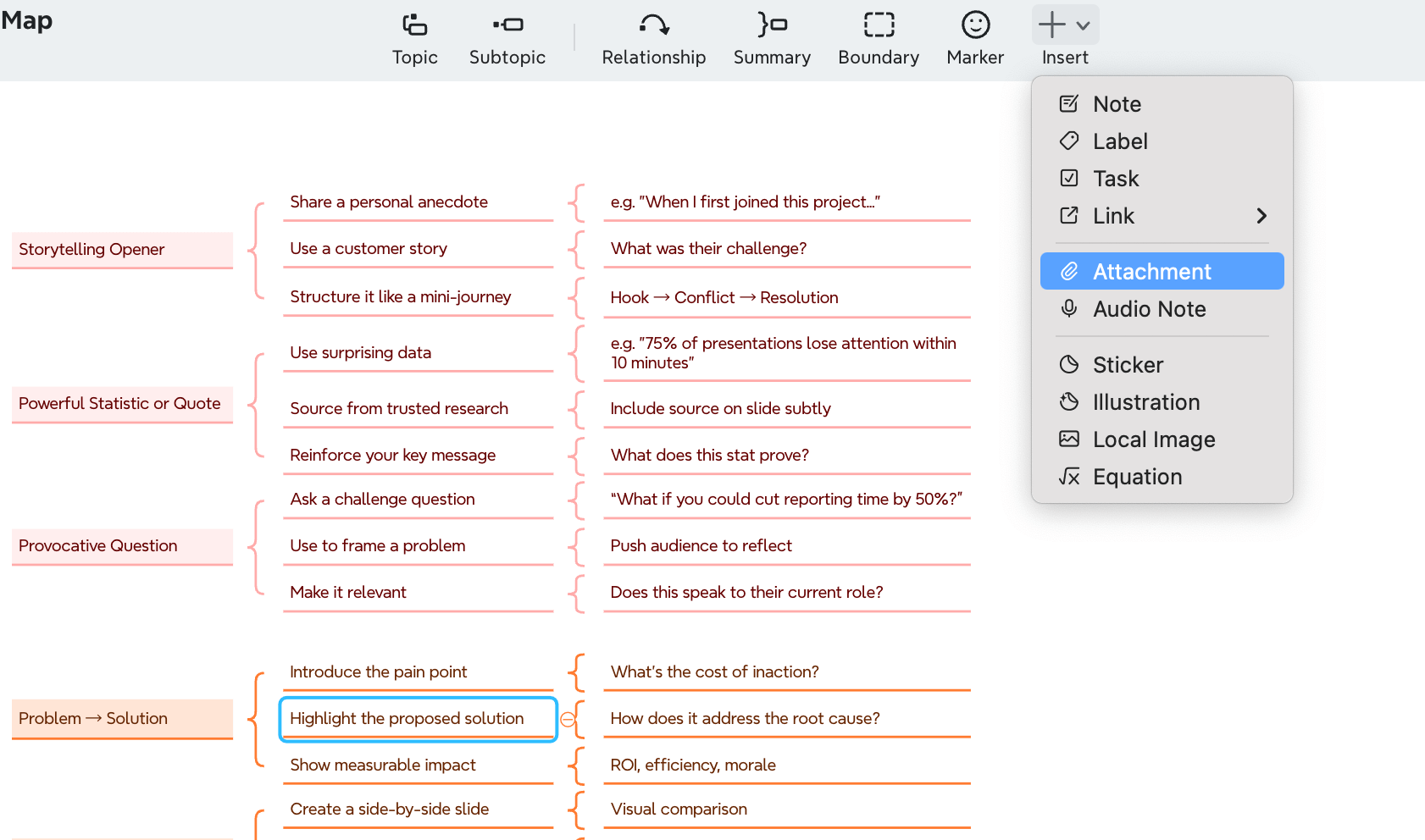
When and How to Use Video Effectively
To maximize video impact in your presentations, consider these guidelines:
Replace complex explanations with demonstrative videos that show rather than tell
Break up lengthy sections by inserting relevant clips at natural transition points
Support key points with expert testimonials or case studies
For seamless integration, PowerPoint offers multiple video insertion options. You can embed videos directly from YouTube or Vimeo, insert videos from Microsoft Stream (for enterprise users), or add video files from your computer. Embedded videos maintain your presentation's professional appearance and eliminate the need to switch between applications during delivery.
Optimal Video Length for Presentations
Short videos generate significantly higher engagement. Research shows:
Videos under 60 seconds achieve the highest viewer engagement rates
After the one-minute mark, engagement decreases exponentially
Videos between 1-5 minutes still maintain at least 50% audience attention
Videos longer than 5 minutes see a steady decline in engagement
For presentations specifically, aim for 30-60 seconds per video clip—similar to a TV commercial. This length provides enough information without disrupting your presentation flow.
Tools for Quick Video Editing
Microsoft Clipchamp, now the official Windows video editor, offers intuitive features for creating presentation-ready clips:
User-friendly interface with templates and intelligent shortcuts
Special effects, text, transitions, and music options
Green screen editing and AI voiceovers
Screen and webcam recording capabilities
After editing, customize video playback in PowerPoint through Format Options. You can set videos to play automatically or on click, adjust start/end times, and mute audio to suit your presentation style.
Use the 5x5 Rule for Text
Text-heavy slides are the primary culprit behind disengaged audiences. The 5x5 rule is a game-changing PowerPoint presentation idea that dramatically improves slide clarity. Research shows that three days after seeing text-only information, people remember just 10% of it, yet that number jumps to 65% when text is paired with visuals.
Breaking Down Complex Information
The 5x5 rule is straightforward yet powerful:
Use no more than 5 words per line
Include no more than 5 lines of text per slide
This creates a maximum of 25 words total per slide
This approach forces you to distill your key points into their most essential form. Instead of paragraphs, keep only the words that carry main thoughts. For complex topics that can't be reduced, consider:
Splitting content across multiple slides
Converting text into simple diagrams or flowcharts
Using Xmind's mind mapping features to organize information hierarchically before creating slides
Font Choices That Improve Readability
Font selection significantly impacts how easily audiences absorb your content. For maximum readability:
Choose sans-serif fonts like Helvetica, Verdana, or Tahoma for body text—their clean lines make them ideal for digital presentations
Consider serif fonts like Georgia for titles or headers to add visual interest while maintaining readability
Stick with system fonts to ensure your presentation appears correctly on any device
Per presentation, limit yourself to 2-3 font variations including weight or effect changes. This creates visual harmony while establishing clear information hierarchy.
Balancing Text and Visuals
Even with minimal text, slides need proper visual balance to be effective. As one expert notes, "when we are designing PowerPoints, try following: one idea per slide". Additionally:
Use ample white space to make content more readable
Apply visual hierarchies through font size, boldness, and color to guide the audience's attention
Incorporate relevant images that complement rather than distract from your text
Consider how your audience processes information—they're simultaneously reading slides and listening to you
Create Custom Icons and Graphics
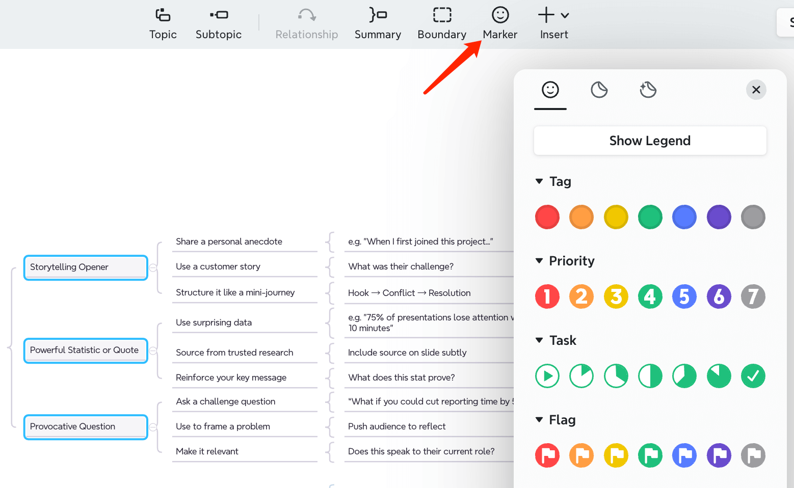
Custom icons and graphics instantly elevate the professional quality of your PowerPoint presentations. Xmind provides abundant visual elements including markers, stickers and illustrations.
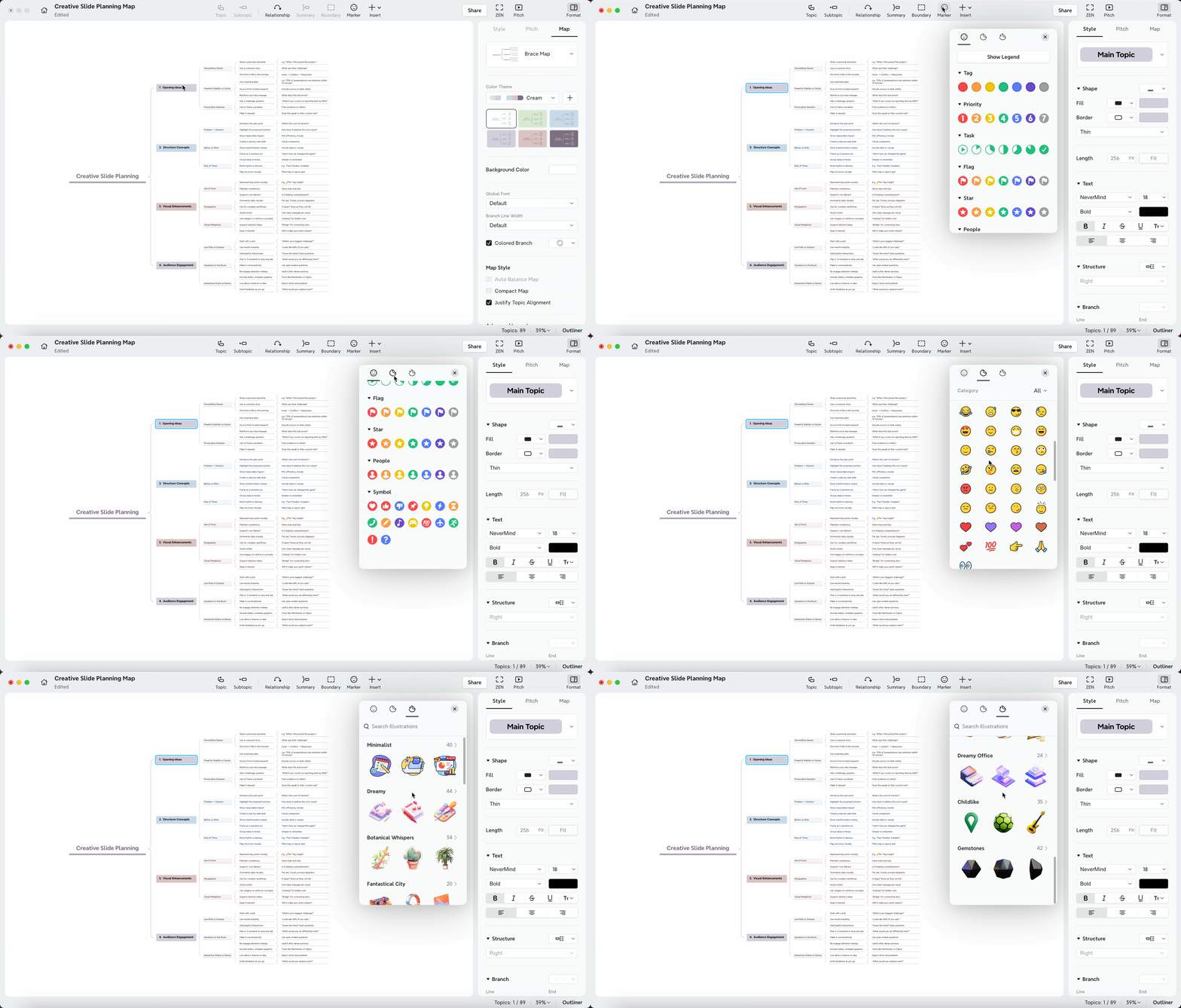
Personalizing Stock Graphics
Indeed, bringing generic icons in line with your branding significantly enhances presentation cohesiveness. Try these techniques:
Create custom icon holders - Place icons on colored shapes that match your brand colors
Add distinctive details - Modify standard icons to make them unique
Apply consistent color schemes - Recolor icons to match your presentation theme
Remove backgrounds - Use PowerPoint's background removal tool to integrate icons seamlessly
After personalizing icons, save them in a dedicated PowerPoint file with descriptive labels to ensure consistent usage across multiple presentations.
Creating Branded Visual Elements
Beyond modifying existing icons, you can create completely custom graphics:
For beginners, Canva offers intuitive tools and templates for creating branded elements without design experience. Throughout your presentations, these custom elements establish a professional, cohesive identity.
For more advanced users, tools like Adobe Illustrator and Photoshop provide extensive features for creating detailed, high-quality graphics tailored precisely to your needs.
Once created, import your custom elements via the Insert tab in PowerPoint, position them strategically, and use formatting tools to adjust size, color, and effects.
Organize your presentation content first with Xmind to identify the perfect placement for your custom icons and graphics.
Implement Storytelling Techniques
Stories captivate human brains in ways facts and statistics alone never can. A compelling narrative activates multiple brain regions, making your PowerPoint presentations more memorable and persuasive.
Creating a Narrative Arc
Every effective presentation follows a story structure that guides audience attention from start to finish. Primarily, use the classic "4 C's" framework:
Context: Establish the current situation
Conflict: Introduce the problem or challenge
Climax: Present the turning point or key insight
Closure: Provide resolution and call to action
This structure helps organize your thoughts in a logical sequence that feels natural to audiences. Actually, research shows that well-structured stories create anticipation and engagement, leading to better retention and understanding.
Using Characters and Conflict
Conflict drives stories by creating tension that demands resolution. Whether presenting business data or technical information, incorporate these conflict types:
Person vs. Person: Competition between companies or ideas
Person vs. Self: Internal struggles or organizational resistance
Person vs. Society: Challenges against established norms
Person vs. Nature/Technology: Overcoming external obstacles
For maximum impact, position your product, service, or idea as the "hero" that resolves the conflict. Thereafter, show how this hero transforms the situation from problem to solution.
Visual Storytelling Elements
Verbal storytelling stimulates two brain areas, but visual storytelling activates multiple regions including the motor cortex, sensory cortex, and cerebellum. To leverage this neural advantage:
Replace text descriptions with representative images
Use consistent visual metaphors throughout slides
Create visual "bookends" with related opening/closing imagery
Apply animations that follow your narrative progression
Map your visual story elements in Xmind first, straightaway seeing how different components connect before creating individual slides.
Use Slide Transitions Strategically
Strategic transitions between PowerPoint slides can transform ordinary presentations into memorable experiences. Thoughtfully selected transitions enhance the flow of your slide deck, maintaining audience attention while creating a polished, professional appearance. In Xmind's Pitch Mode, you can choose to use animation for slide presenting or not.
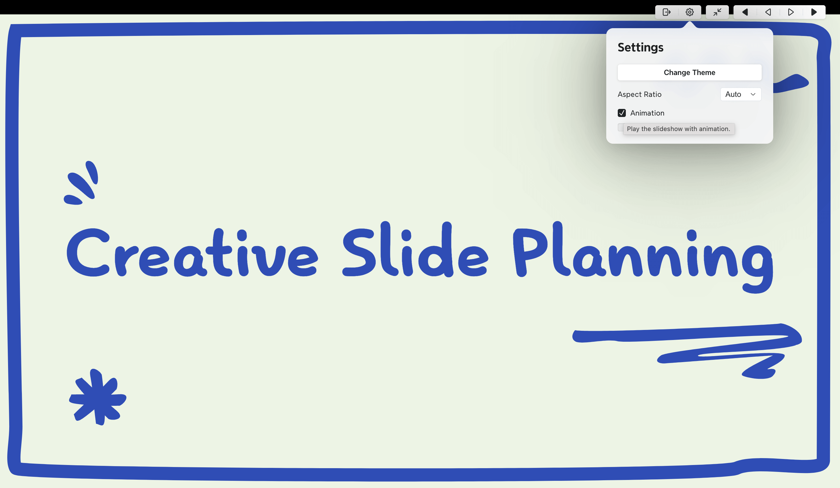
Types of Transitions That Add Meaning
Not all transitions serve the same purpose. Choose transitions that match your presentation's content and mood:
Fade: Perfect for formal business presentations where subtlety is key
Push or Slide: Ideal for sequential information or timeline presentations
Morph: Excellent for showing transformation or evolution of concepts
Zoom: Effective for emphasizing specific details within a larger context
For example, using a "Fade" transition creates a sense of continuity between related points, while a "Push" transition visually signals a shift to a new topic.
Avoiding Transition Overload
Flashy transitions might seem engaging initially, although they often undermine professionalism. To maintain a polished presentation:
Limit your selection to 1-2 transition types throughout your deck
Apply transitions only where they enhance understanding
Adjust duration settings (typically 0.5-1.5 seconds works best)
Preview all transitions before finalizing your presentation
As a rule of thumb, transitions should be noticeable enough to serve their purpose without drawing attention to themselves.
Creating a Cohesive Flow
Transitions should guide your audience through your narrative seamlessly. Despite having well-designed individual slides, poor transitions can disrupt the presentation's rhythm.
First, establish a consistent pattern that helps audiences anticipate what's coming next. Second, consider using speech transitions alongside slide transitions ("As we move from planning to implementation...") to reinforce connections between ideas.
Incorporate Real-Time Data Feeds
Real-time data integration transforms ordinary slides into dynamic, information-rich experiences. By organizing your presentation structure first with Xmind, you'll identify perfect opportunities to incorporate live data feeds that keep your content current throughout your delivery.
Tools for Live Data Integration
Several powerful tools enable seamless live data integration in PowerPoint:
DataPoint connects presentations directly to various data sources including SQL databases, Excel spreadsheets, RSS feeds, and social media statistics. This plugin refreshes information automatically at set intervals, ensuring your slides display the most current data available as you present.
Power BI add-in brings interactive dashboards and visualizations directly into PowerPoint. Upon installing this Microsoft add-in, you can add live report pages to your slides that update automatically. Correspondingly, you can share access permissions so viewers don't need to request access to see your data.
CustomShow offers a cloud-based platform that enables smooth collaboration with real-time data integration. Plus, it provides slide-by-slide engagement analytics showing exactly how audiences interact with each element of your presentation.
Types of Dynamic Content
Dynamic content adapts based on data, user behavior, and preferences:
Live dashboards display key performance metrics that update throughout your presentation
Real-time charts connect to databases for continuously refreshed visual data
Automated text updates pull the latest figures into designated text fields
Interactive data exploration allows on-the-fly filtering and adjustment
Given these capabilities, even recurring presentations become effortless—simply refresh connections when opening your file for instantly updated content.
Design Considerations for Live Data
For effective real-time data integration:
Maintain visual clarity – Create easily scannable layouts that highlight key metrics
Set appropriate refresh intervals – Configure update frequency based on data volatility
Provide context – Include explanatory text that helps interpret changing data
Plan for contingencies – Prepare static backup slides in case of connection issues
Design for Mobile Viewing
In a world where mobile internet usage now exceeds desktop browsing, ensuring your PowerPoint presentations display correctly on smartphones and tablets is no longer optional. Given that 75% of mobile users respond to mobile-optimized content for purchases, your presentations must work flawlessly across all devices.
Responsive Design Principles
Responsive design ensures your presentation adapts seamlessly to different screen sizes and orientations. For this purpose:
Use fluid grids that automatically resize content proportionally
Implement flexible images that maintain aspect ratios across devices
Ensure readable text sizes (minimum 30-32 point for body text, 60 point for headlines)
Apply high contrast between text and backgrounds for better visibility
As a result of embracing these principles, your presentations will remain legible and impactful regardless of screen size.
Testing Your Presentation on Multiple Devices
Prior to delivery, test your presentation across various devices to identify potential problems:
Use BrowserStack or similar tools to preview your presentation on countless device types
Check how your slides appear in both landscape and portrait orientations
Verify that interactive elements remain functional on touchscreens
Test under different network conditions (Wi-Fi, 4G, 3G) if using online features
In addition to emulators, always test on actual physical devices when possible, as they provide the most accurate representation of the user experience.
Mobile-First Design Approaches
Mobile-first design starts with the constraints of small screens, more importantly focusing on:
Simplicity and essentials - following the "1 idea = 1 slide" rule
Large, full-slide images with minimal text overlay
Clean, simple charts without overwhelming details
Limited animations and transitions to ensure smooth performance
Under those circumstances where presentations must be viewed on phones, consider creating a dedicated mobile version with Xmind's presentation mode, which automatically adapts your content for optimal viewing on any device.
Create Memorable Title and Closing Slides
Your PowerPoint presentation's first and last impressions profoundly impact audience recall. Designing compelling title and closing slides acts as the perfect frame for your content, creating a professional, cohesive experience from start to finish.
Title Slide Design Techniques
Your title slide sets expectations for your entire presentation. As Einstein noted, "simplicity is the ultimate sophistication," which applies perfectly to title slide design. An exceptional title slide gives audiences hope that the presentation will be equally impressive, while a poorly designed one immediately suggests lack of attention to detail.
For maximum impact, try these techniques:
Use a single striking background image with minimal text overlay
Create visual interest through strategic white space
Incorporate client logos when appropriate for business presentations
Apply complementary colors like blue and orange to create dynamic, attention-grabbing visuals
Remember to spend extra time perfecting your title slide as it establishes the tone for everything that follows.
Call-to-Action Strategies for Closing Slides
A powerful closing slide should prompt immediate response from your audience. The best approach is a clear, direct command telling viewers exactly what to do next. Consider these strategies:
Use bold colors and strong contrast to highlight action items. Visual elements like buttons or arrows can effectively guide attention to specific keywords. Keeping layouts minimalistic ensures your message remains the focal point.
Primarily, limit yourself to one CTA per slide—multiple options dilute impact and confuse audiences about next steps. Your CTA must maintain consistency with your overall design while using active language that encourages immediate engagement.
Creating Visual Bookends
Bookending brings your audience full circle, providing psychological closure and strengthening your key message. Start with an engaging hook—an anecdote, visual, or question—then echo this element in your closing slide.
Try using Xmind to plan these bookends effectively. This technique creates a satisfying experience by recapitulating your opening theme, cementing it in listeners' minds through repetition while providing closure.
Effective visual bookends connect emotionally with viewers, making your presentation more memorable than the typical linear format where slides seem disconnected from one another.
Use Whitespace Effectively
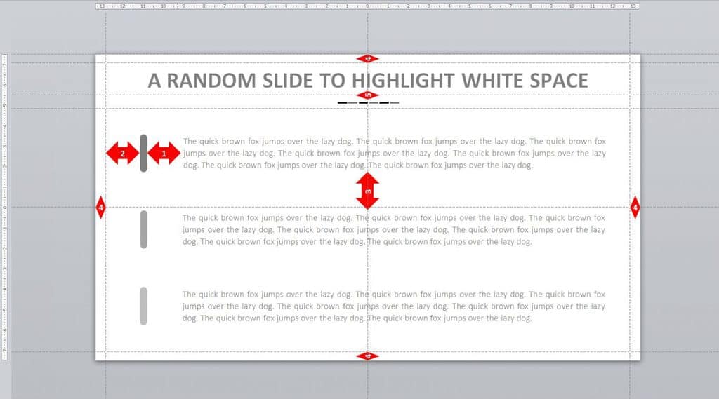
Whitespace isn't simply empty areas on your slides — it's breathing room that allows your message to stand out. Effective use of whitespace can transform cluttered PowerPoint presentations into polished, professional experiences.
The Psychology of Whitespace
Whitespace serves multiple critical roles in presentation design. First, it creates visual hierarchy, emphasizing key points by isolating them from surrounding content. Generally, our brains process information more efficiently when it has room to "breathe." Think of whitespace as the pause between sentences—it allows your audience to absorb information without feeling overwhelmed. With proper whitespace, your audience naturally knows where to focus, making your powerpoint presentation ideas more impactful and memorable.
Balancing Elements on a Slide
To effectively balance slide elements:
Maintain consistent margins (minimum 0.5 inches) on all sides of your slides
Group related items together and surround them with whitespace
Follow the 2/3 rule—content should occupy no more than two-thirds of your slide
Use PowerPoint's Smart Guides to maintain consistent spacing
Simply creating a clean, minimalist template from the start makes implementing whitespace easier. Furthermore, proper alignment is crucial—well-aligned elements make whitespace appear more intentional and effective.
Common Whitespace Mistakes to Avoid
Clearly, the most frequent whitespace error is cramming content right to the slide edges. This creates a visual assault that overwhelms viewers. Additionally, inconsistent spacing between elements makes slides appear unprofessional.
Other common mistakes include:
Filling every empty space because it looks "incomplete"
Ignoring line spacing within text blocks
Creating slides with competing focal points
Using PowerPoint's default text boxes, which often lead to cluttered slides
Replace Bullet Points with Visual Alternatives
Bullet points kill presentation engagement faster than almost anything else. According to research, audiences retain 65% more information when visual alternatives replace traditional bullet lists.
Icon-Based Lists
Icons transform abstract concepts into visual shorthand that audiences immediately understand. This approach adds visual appeal while serving as a mnemonic device to improve information retention. For optimal results:
Select simple, recognizable icons that directly represent your points
Maintain consistent styling across all icons (outline weight, color scheme)
Use these same icons throughout your presentation when referencing related topics
This visual coding language helps your audience track concepts across your entire presentation. In the same way, icons create powerful associations between ideas, enhancing recall of key points long after your presentation ends.
Timeline Visualizations
Timeline arrangements transform ordinary bullet lists into engaging visual stories. By comparison, timelines work exceptionally well for:
Chronological sequences of events
Project phases and milestones
Historical developments
Step-by-step procedures
Google Slides offers built-in timeline templates through the Insert > Diagram > Timeline menu, allowing you to select designs with 4-6 milestone points. For one thing, curved timelines, roadmap-style progressions, and even hand-drawn versions provide visual variety while maintaining logical flow.
Process Diagrams and Flowcharts
Process diagrams break complex procedures into visually connected steps. In this situation, PowerPoint's SmartArt feature becomes invaluable:
Navigate to Insert > SmartArt
Select the Process category
Choose a flowchart layout that matches your concept
Replace placeholder text with your content
Modify colors through the SmartArt Design tab
For custom flowcharts, use PowerPoint's Shapes gallery, specifically the Flowchart group for standard process symbols. The rectangle represents main process steps, diamonds indicate decision points, and elongated ovals mark the beginning and ending points.
Conclusion
Transforming boring PowerPoint presentations into engaging experiences requires thoughtful planning and execution. Each technique, from mind mapping to interactive elements, plays a vital role in capturing audience attention. Visual storytelling, strategic transitions, and effective whitespace create presentations that resonate with viewers across all devices.
Ready to elevate your next presentation? Try Xmind to organize your ideas and create impactful slides that keep audiences engaged. Remember - successful presentations balance clear communication with visual appeal, ultimately delivering messages that stick with your audience long after the final slide.
FAQs
How can I make my PowerPoint slides more engaging?
To make your slides more engaging, use mind mapping tools like Xmind to organize your ideas, implement a consistent visual theme, replace text-heavy slides with infographics, and incorporate interactive elements like clickable menus or embedded polls.
What's the best way to present data in a PowerPoint presentation?
The most effective way to present data is through visual alternatives like infographics, charts, and graphs. Use tools like Canva or PowerPoint's built-in features to create professional-looking data visualizations that are easy for your audience to understand at a glance.
How can I make my presentation more memorable?
To make your presentation more memorable, implement storytelling techniques by creating a narrative arc with a clear beginning, middle, and end. Use visual bookends, incorporate short video clips, and create custom icons and graphics that align with your brand or message.
What's the ideal amount of text to include on a PowerPoint slide?
Follow the 5x5 rule: use no more than 5 words per line and no more than 5 lines of text per slide. This approach forces you to distill your key points into their most essential form, making your slides clearer and more impactful.
How can I ensure my presentation looks good on different devices?
Design your presentation with mobile viewing in mind by using responsive design principles. Implement fluid grids, use a minimum 30-32 point font size for body text, and test your presentation on multiple devices to ensure it looks good and functions properly across different screen sizes.
What is the 5 5 5 rule in PowerPoint?
The 5/5/5 rule is a simple design guideline to help keep slides clean and readable. It suggests no more than 5 words per line, 5 lines of text per slide, and no more than 5 text-heavy slides in a row. The idea is to reduce clutter and keep your audience focused on what you’re saying—not just reading the screen. While it’s not a strict rule, it’s a good reminder to simplify your content and let visuals do the heavy lifting.
More Posts
Understanding Knowledge Management - A Visualization Guide
Struggling with knowledge management? This guide explores practical solutions and how to visualize your KMS using mind maps.

10 Best Presentation Software Tools for Remote Teams (2025 Guide)
Discover the best presentation software with AI power for remote teams in 2025. Compare tools (Xmind) and features to boost team communication and visual storytelling.

Visual Communication: Making Your Presentations Understood
Discover what visual communication is and how to use it in presentations. And use Xmind in this process to clarify ideas, boost engagement, and deliver your message.


One space for all your ideas
Organize thoughts, visualize structures, connect ideas, and unlock insights.
Get Started for Free


